Enhancing Health Insurance keywords in an easier way to increase user satisfaction
Project Subject
Health insurance is a contract that covers medical expenses for illnesses, injuries, and preventive care. It is often mandatory to ensure individuals have access to necessary healthcare and to manage the financial risk of medical costs.
Challenge
Complexity of Health insurance systems make users frustrated that leads to spend alot of money and a decrease in users satisfaction
Solution
Developed an interactive solution providing short, easy-to-understand health insurance courses, that include quizzes, a member forum, and certificates with coupon codes for passing, enabling users to advance to the next course.
Design Methods
User research: user interviews, persona mapping, journey mapping, competitive analysis
UX Design: user flows, ideating solutions, sketches, wireframing.
Team
James Thames, Shweta Dhingana, Jasdeep Kaur, Jaye Xaymongkhonh, Johnna Harrison, Gianna Guerra
My role
I participated in conducting interviews, brainstorming ideas, and created prototypes
Conducted usability testing to know users feedback
Tools
Figma | Mural | Miro
Outcome
By fostering a unified design approach, we effectively bridged the gap between user understanding and health insurance concepts. This approach resulted in a more engaging and user-friendly platform, enhancing both knowledge retention and user satisfaction.
Problem: Lack of Transparency in Coverage Policies
Health insurance complexity leads to dissatisfaction and confusion among U.S. adults, who often struggle with coverage details, costs, benefits, qualifications, terminology, and provider networks (KFF, 2003). This confusion causes anxiety, disrupts healthcare markets, and increases financial and health risks.
Many consumers are unaware of where to seek help and have limited knowledge of their rights to appeal insurer decisions.
- Empathize
Identifying Key Users
Our target audience was from 20 years to 70 years, because mostly these are the people who struggle with understanding health insurance and those who are new to this term.
Identifying User Frustrations
We conducted primary and secondary research, went through some articles and conducted total 19 Quantitative interviews were conducted by whole team.
Objectives
- To understand the pain points and challenges of user in health insurance
- what are gaps in current health insurance services?
Reasoning
I chose to conduct interviews to feel their emotions of their problems and frustration to delve further into the problem. Since I collected quantitative data (based on some questions) which gave me general idea of where is the problem.
Expensive Medications
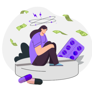
Surprising bills leads to financial stress which ultimately cause mental stress
Trail and Error

User don’t receive any sort of training prior to having insurance and gained a little knowledge through trial and error.
Low Expectations
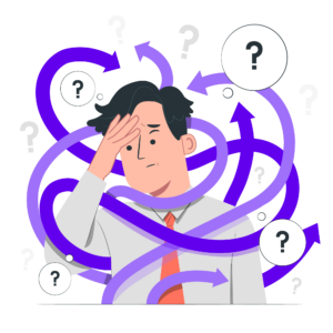
Health Insurance providers are not clear about what they are going to cover and dont provide a guide for help, which keeps customers in low expectations
Assistance
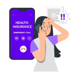
Customer Support of health insurance hardly give any response of query, its hard to connect with them and understand tough words of insurance.
Decoding Industry Competitors
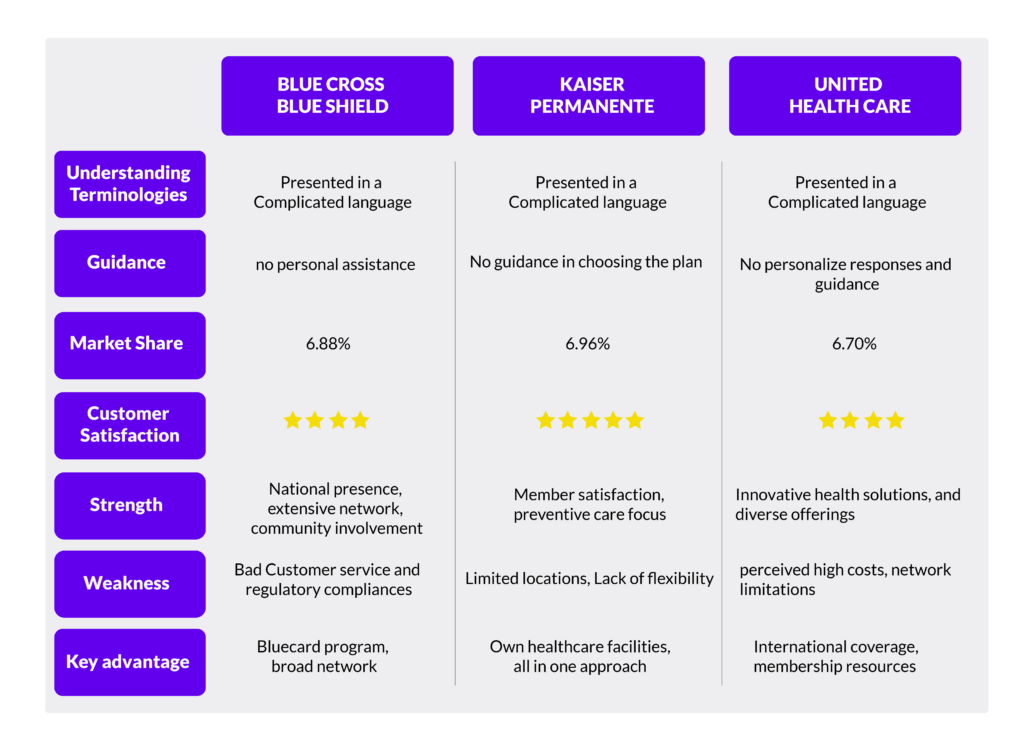
Since there are companies who are providing services of insurance, goal is to identify where they are creating gap.
Objective
- To understand the services of united healthcare, blue cross blue shield, and kaiser premenante
- To know about differences among these service providers
- how health insurance guidance is displayed on websites of these providers
- Define
Turning Pain Points into Purpose
From my user interviews and market research, I reached to putting them in the goals to achieve them in a solution.
Query Response
Users reported that its hard to get in touch with customer support of health insurance, they hardly answer any query.
Guidance
There is no Guidance on website of service provider that which plan will be best for any new user.
Easy & Simple Terminologies
From conducting interviews, it was cleared that many users are struggling to understand the insurance language, due to this barrier they always get confused and frustrated.
Financial Assistance
Many users reported that they find medications very expensive and with surprise bills, it become so difficult to cover all the expenses.
- Brainstorm
Unleashing Idea Storms
Prioritizing these goals, we brainstormed simple, easy-to-implement solutions suitable for a time-limited, non-profit project. We focused on features that are easy to remember and navigate, and came up with several options.
-
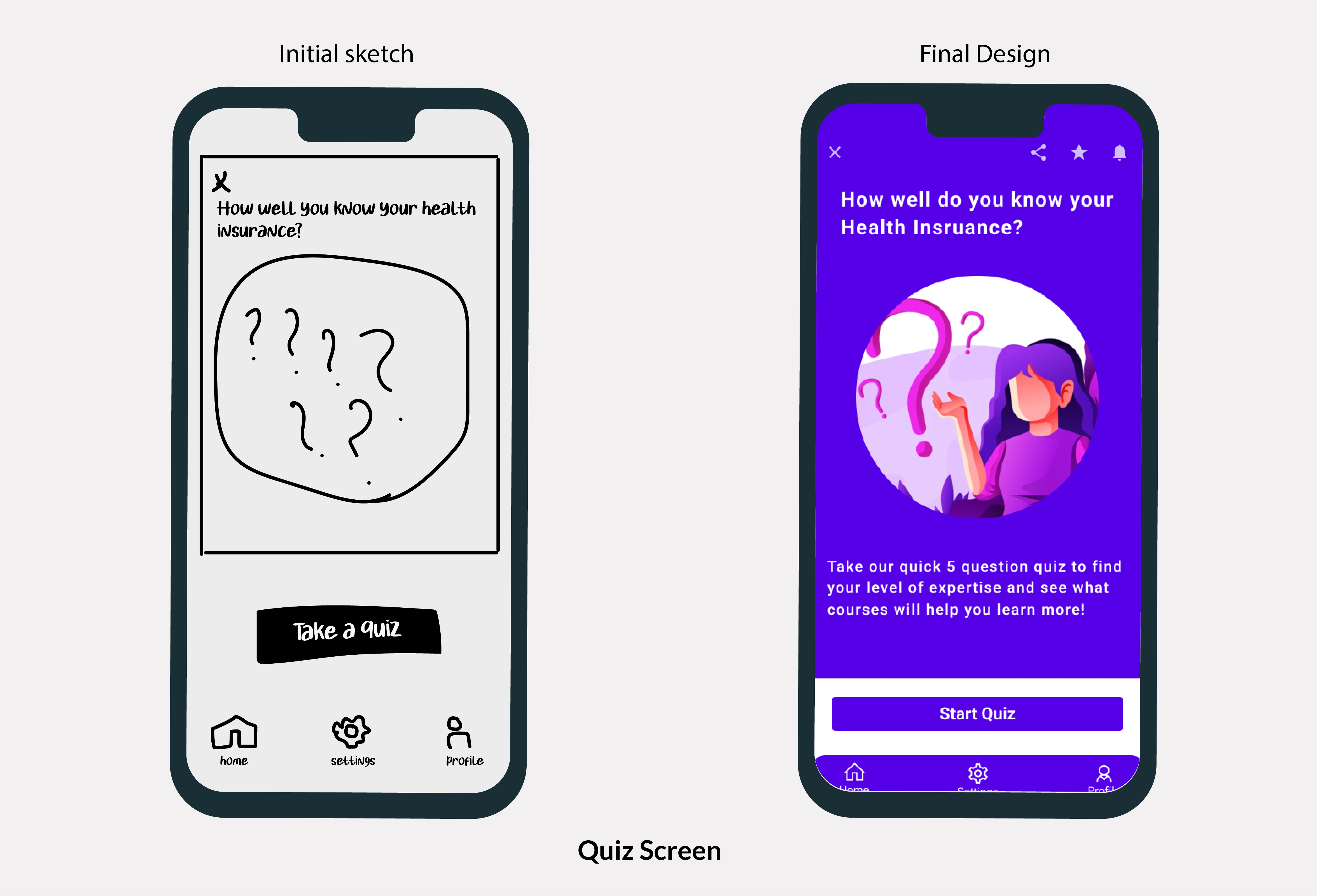
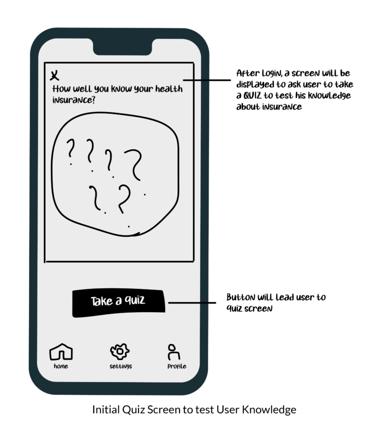
- Quiz Screen to test User Knowledge about insurance
- Offering them courses according to their passing result
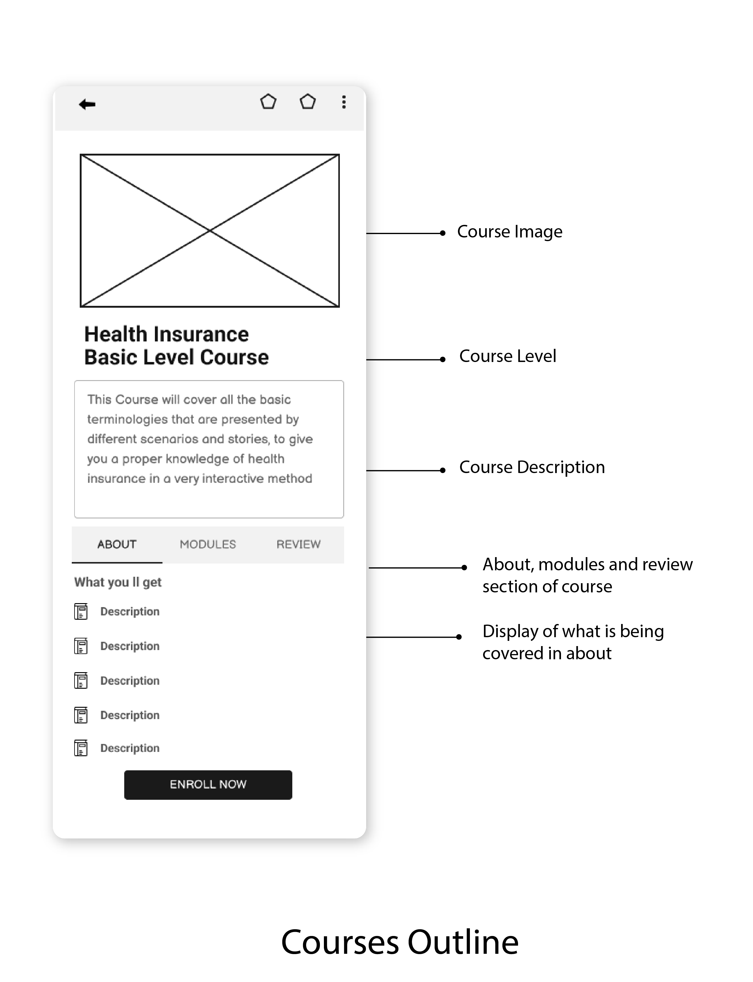
- Enrollment of courses with detailed outline of course
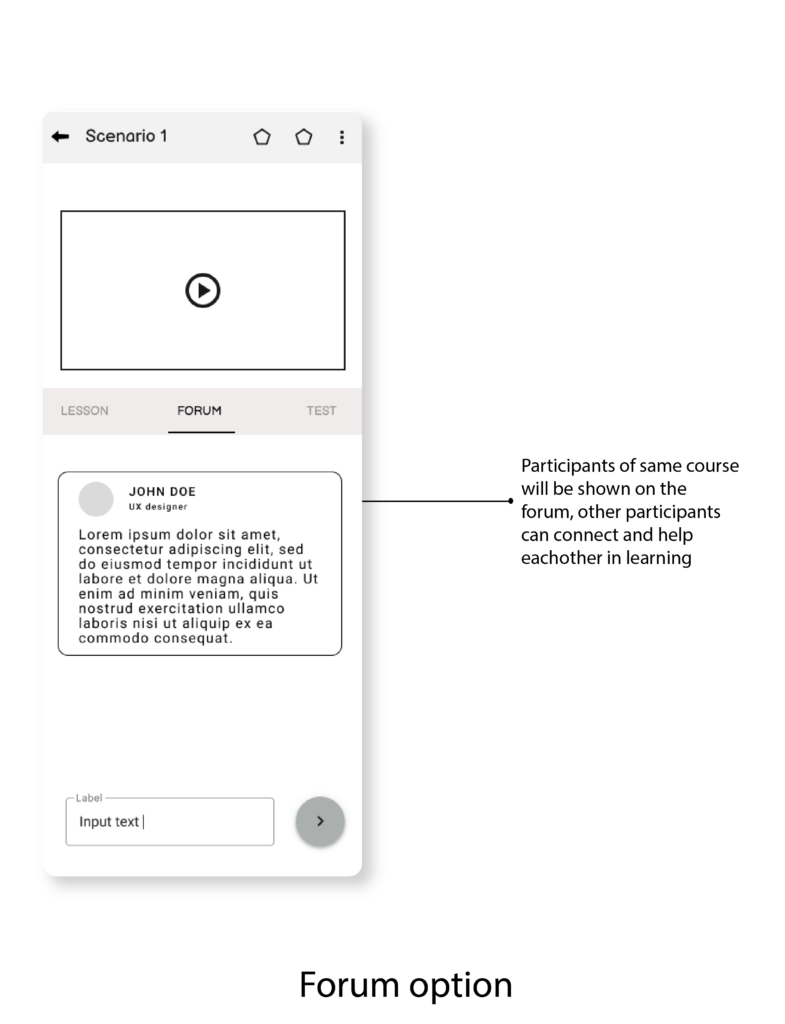
- Option of Forum to engage with other participants
- On completion of Course, Quiz taking option to test his learning
- Certification and reward in the form of Coupons
- Ideate
Conceptualizing Solutions
Converting Brainstorming points into Sketching the Solutions
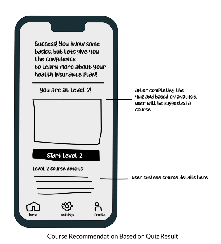
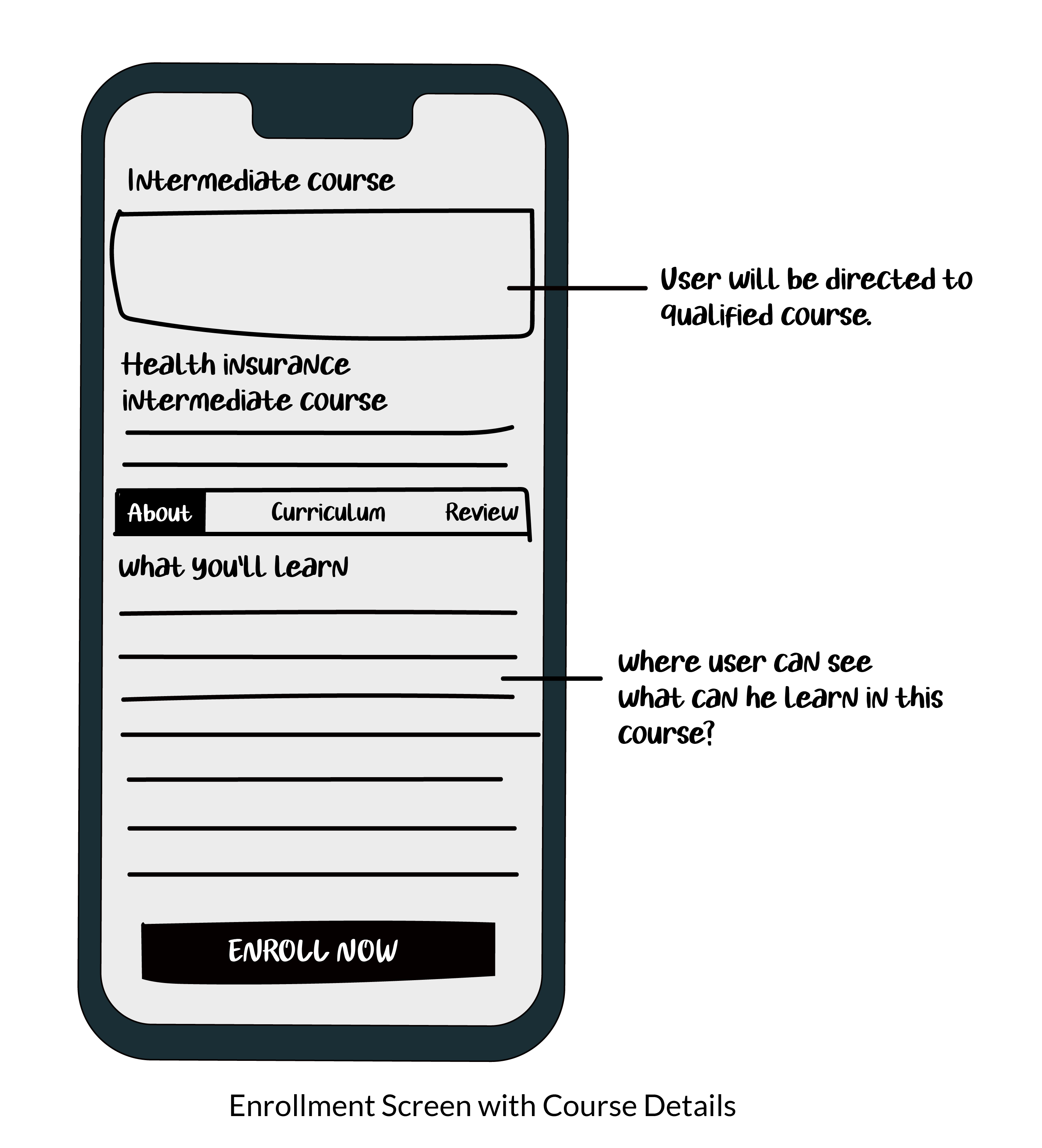
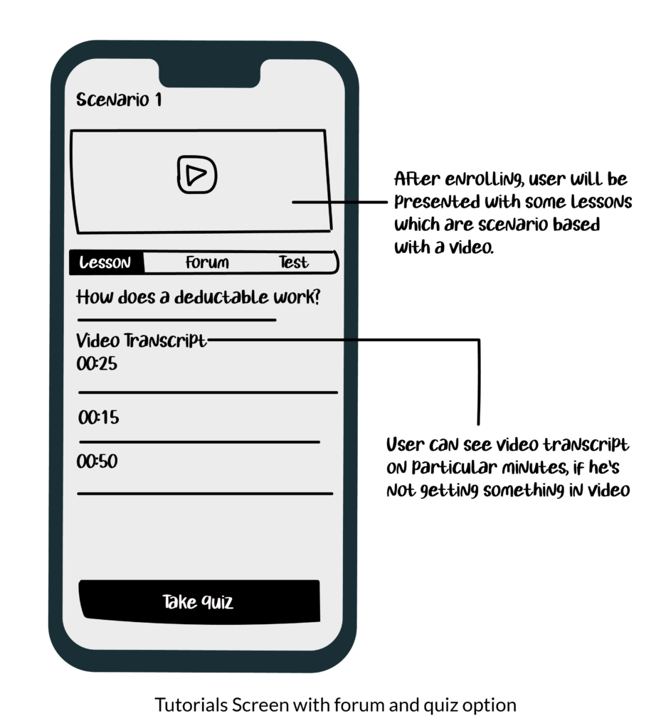
-Wireframing and Prototyping
Sketching Functional Designs
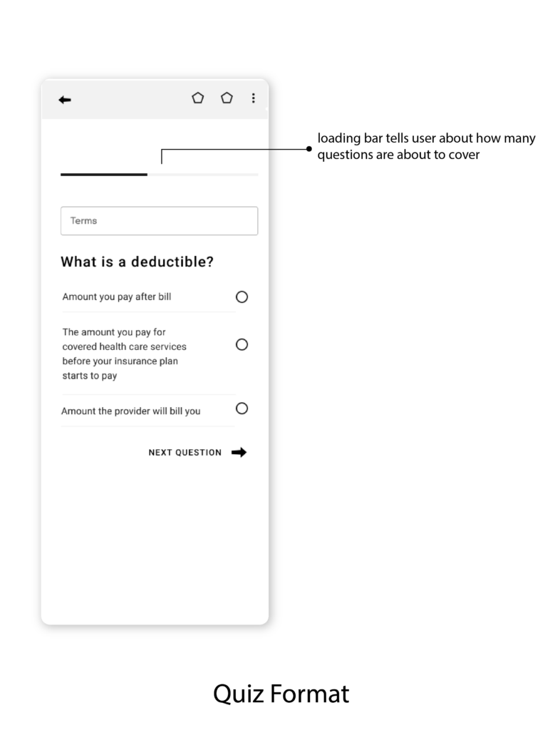
- Usability Testing
Evaluating User Experience
Before going into high fidelity designs, I conducted
Objectives
-
- To identify errors, friction points, and gather feedback from real users and to make sure, the product is easy to use, efficient and enjoyable to users.
- To figure out if there’s any missing element in the product from users perspective and make the experience more better.
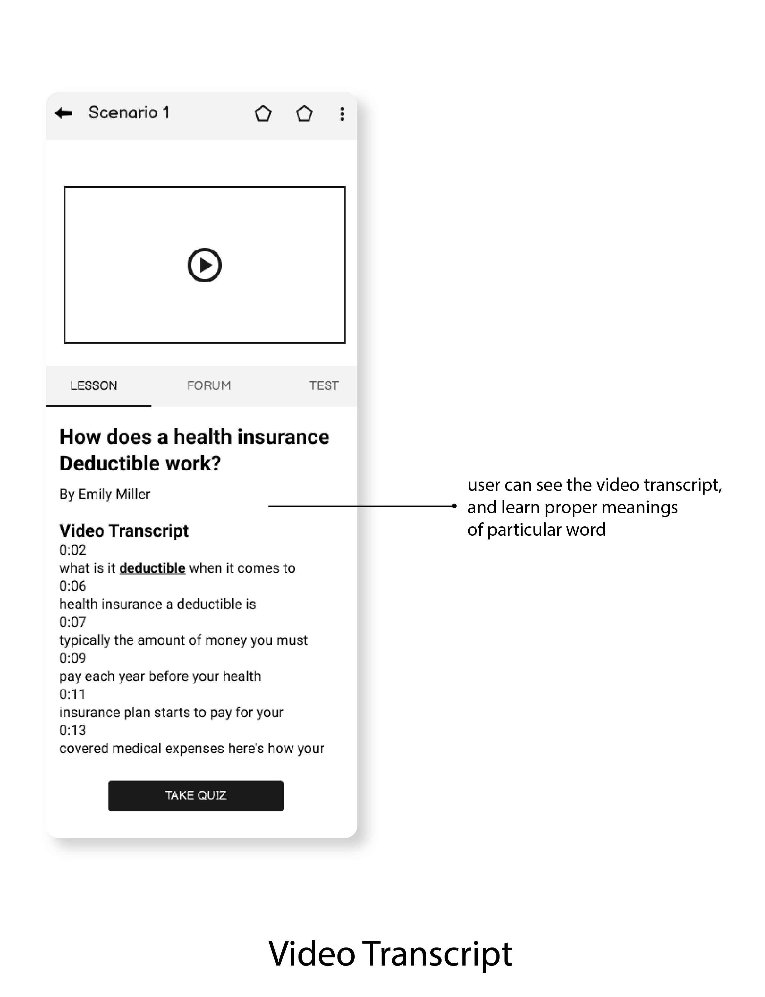
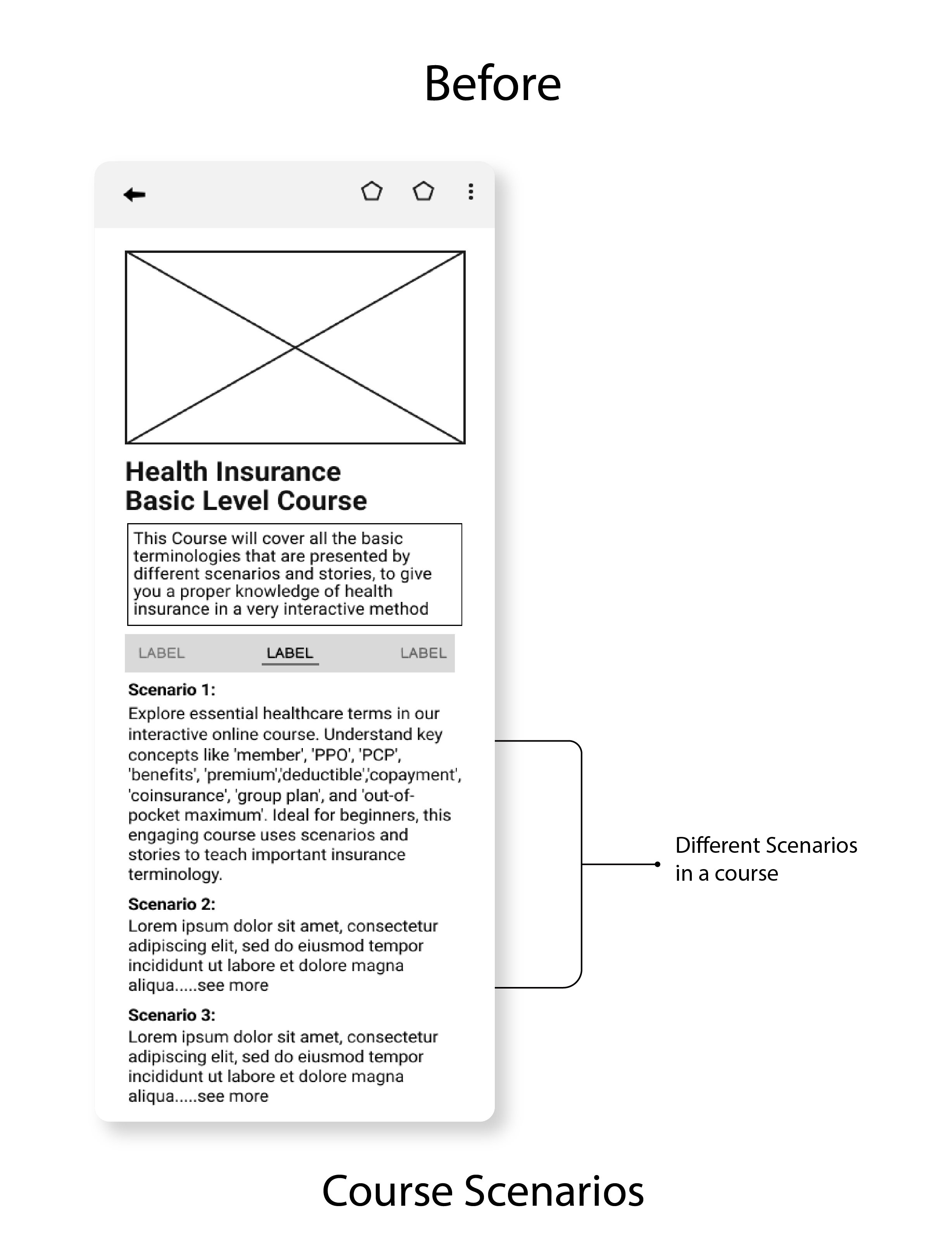
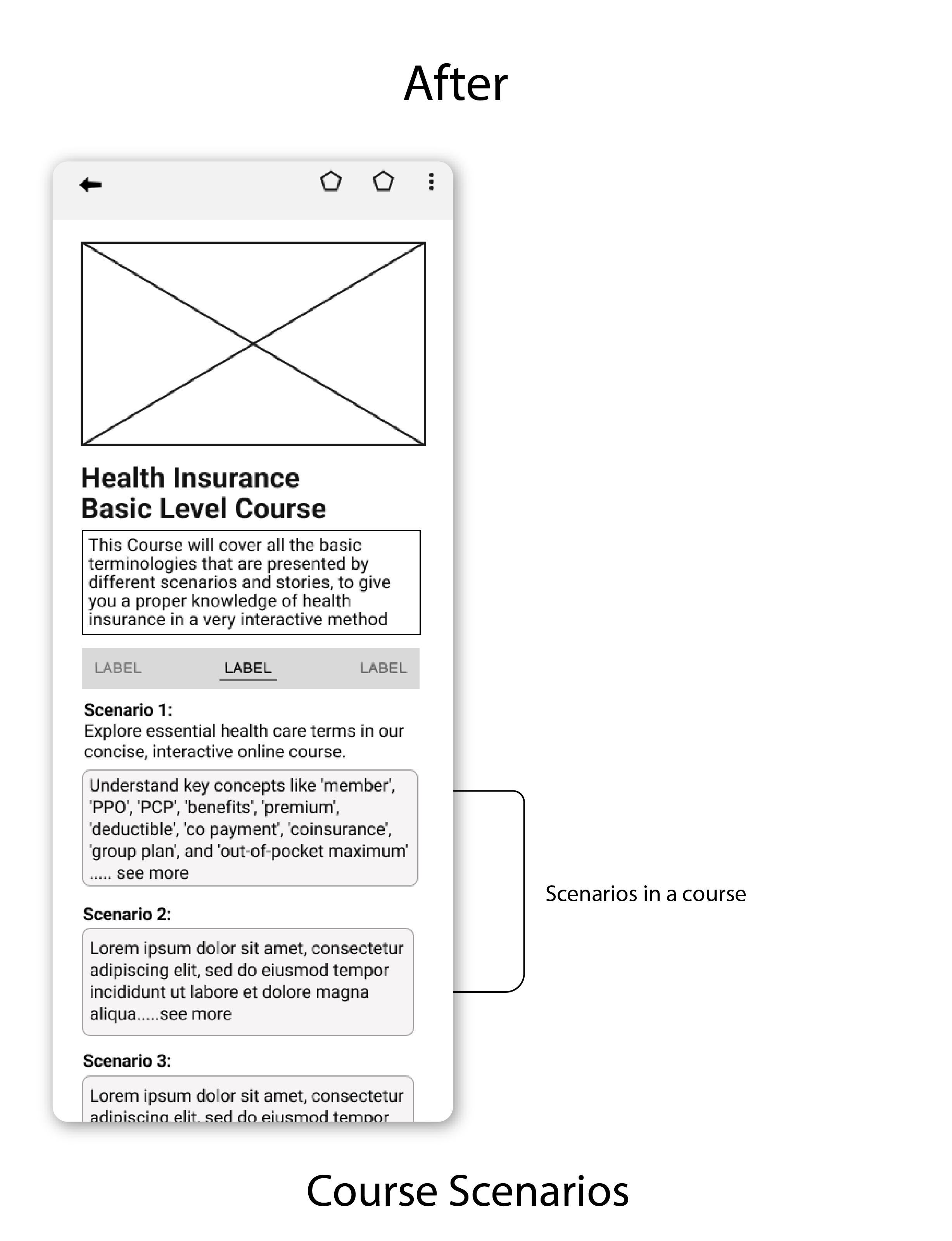
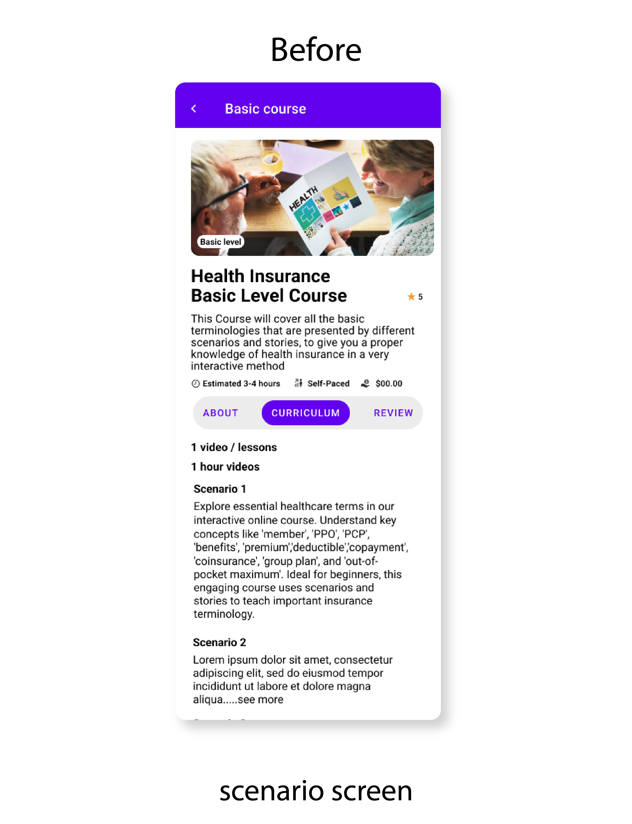
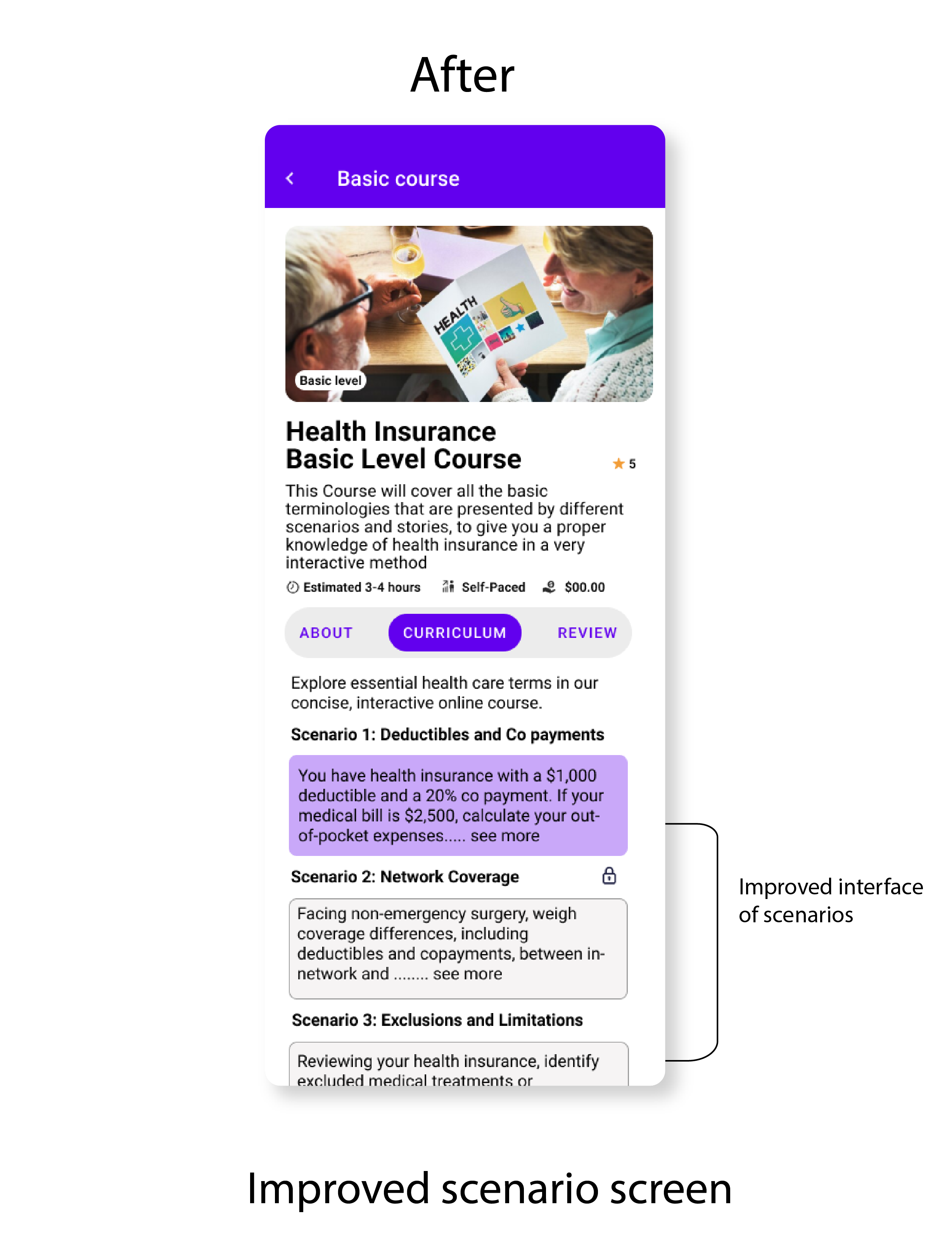
Users find Scenarios screen overwhelming
Users reported that there is overload of text on scenarios screen and visually not appealing
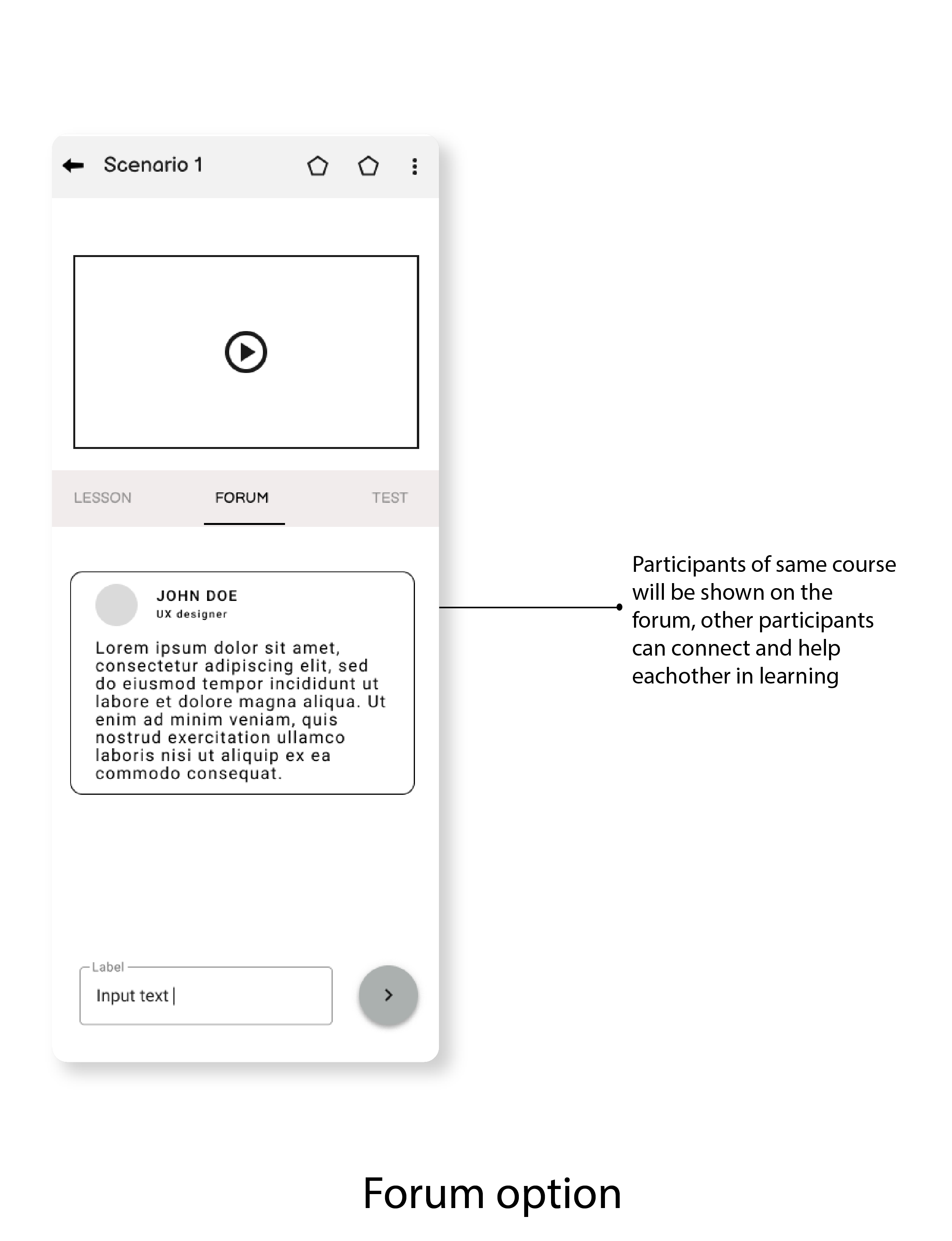
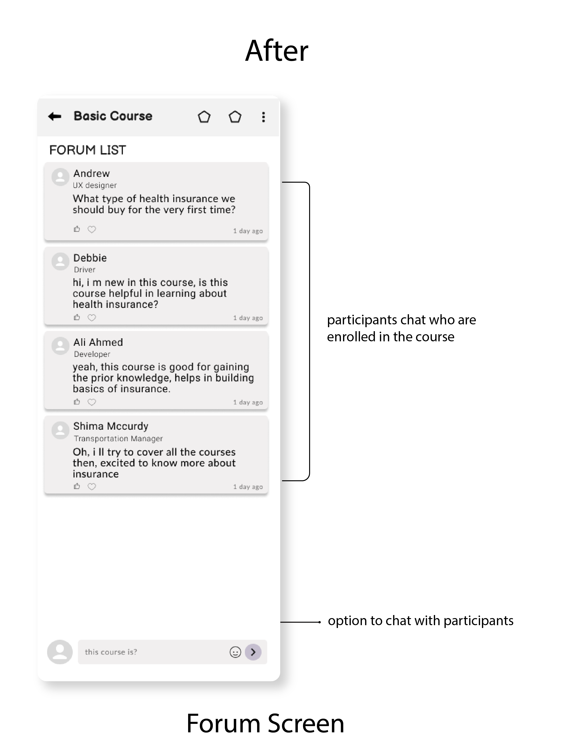
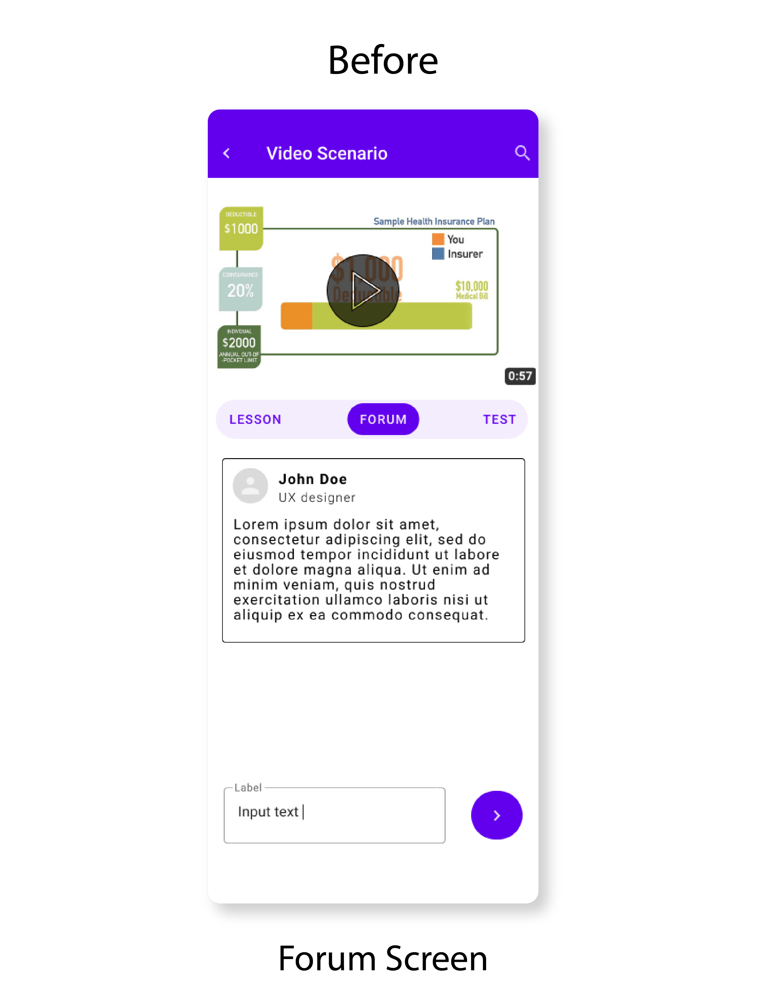
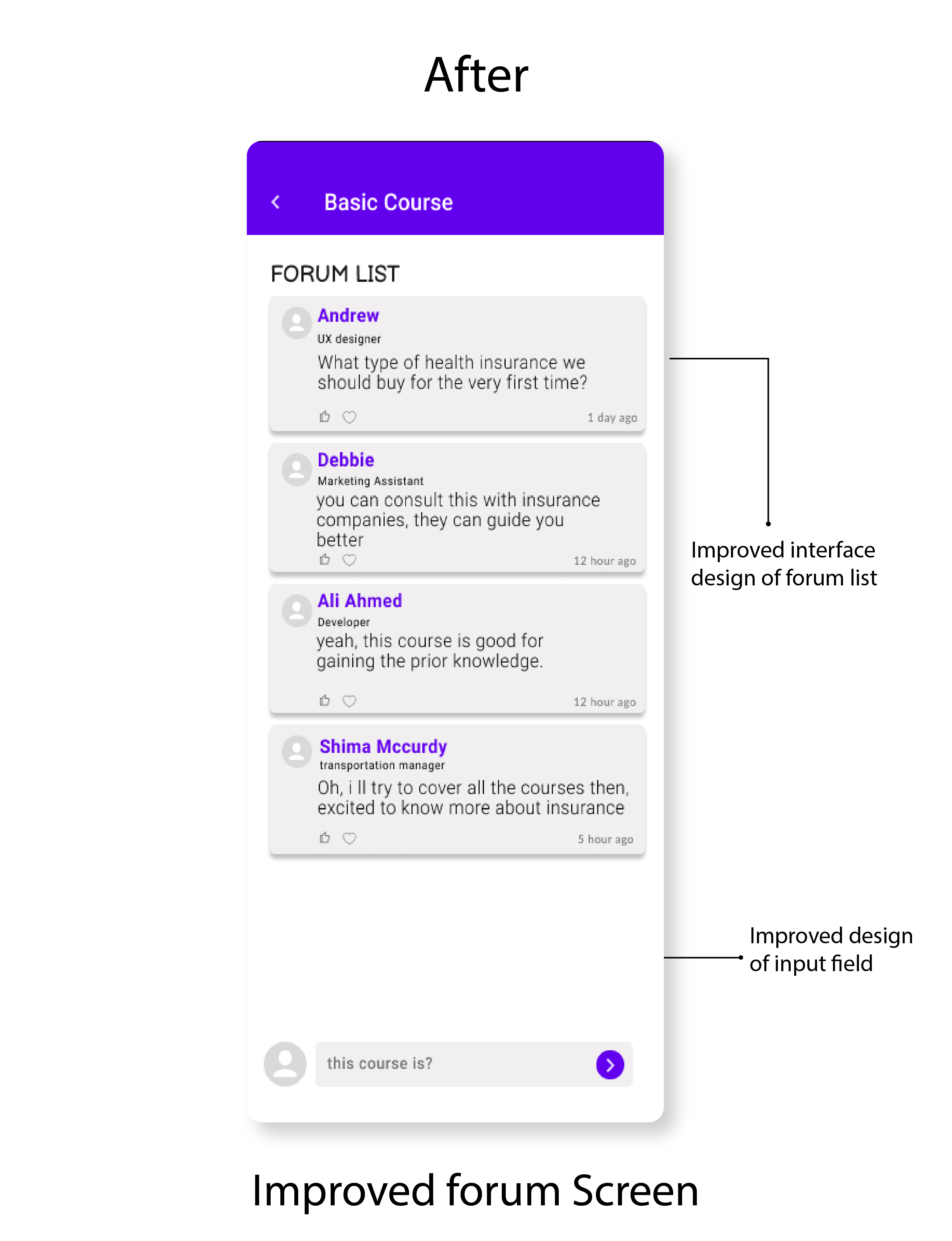
Users ask to enhance forum screen
Users asked to update the forum option, now its not giving a feeling of forum to join in.
Improvement 1
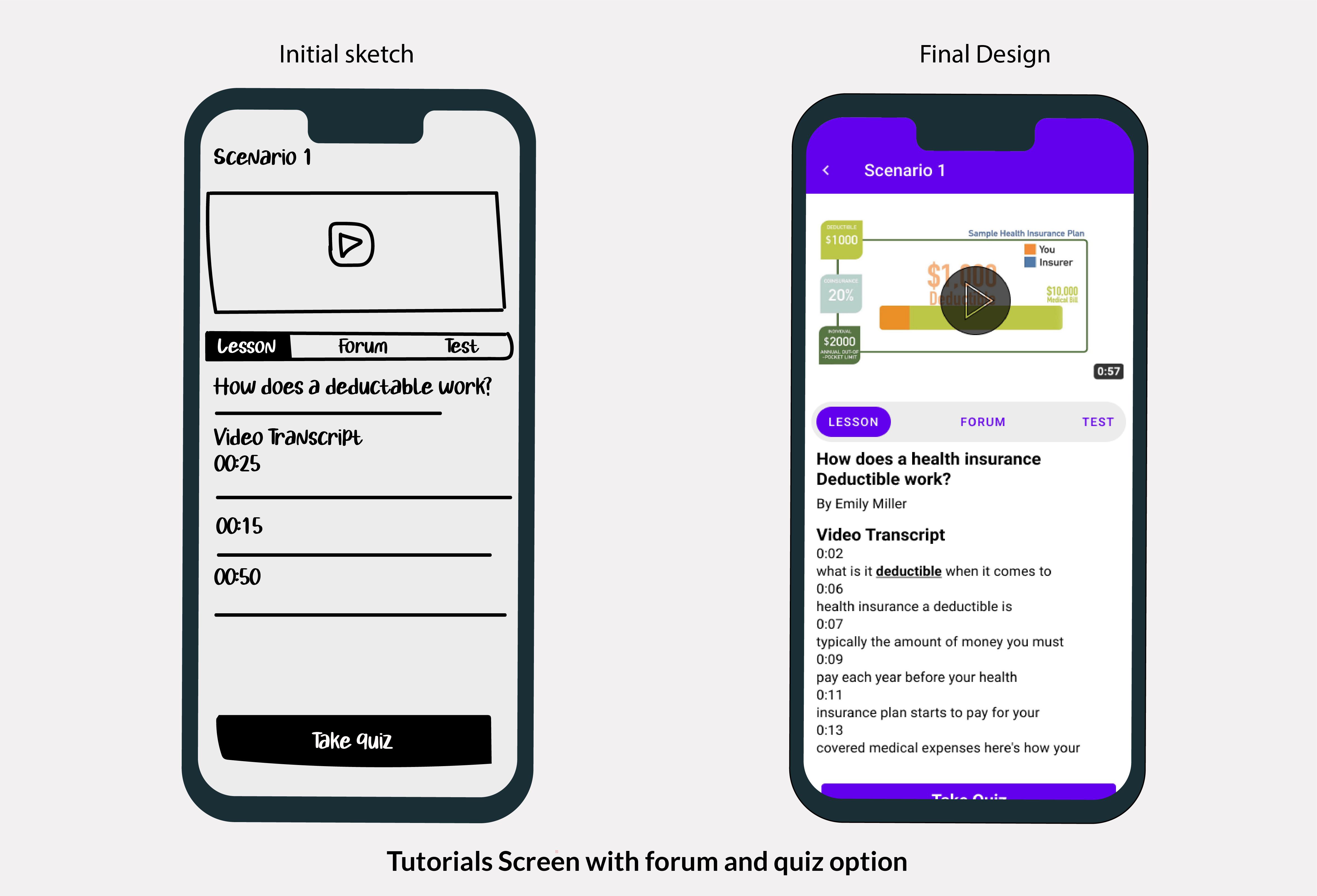
I decided to design the scenarios screen with less text and with see more option that reduces the cognitive load of text, and users can use their mental effort easily to go through the scenarios.
Improvement 2
I decided to remove the course video option on forum screen, as it was kind of distraction for users and give more space to forum section, so that users can easily interact with each other.
Iteration on High Fidelity
I decided to move on improving high fidelity design, i recognized that in previous design there were clutter of some text and need of some visual improvement, which i have improved here based on feedback of users and by following some inspirations and guidelines.
Finalizing Design Solutions
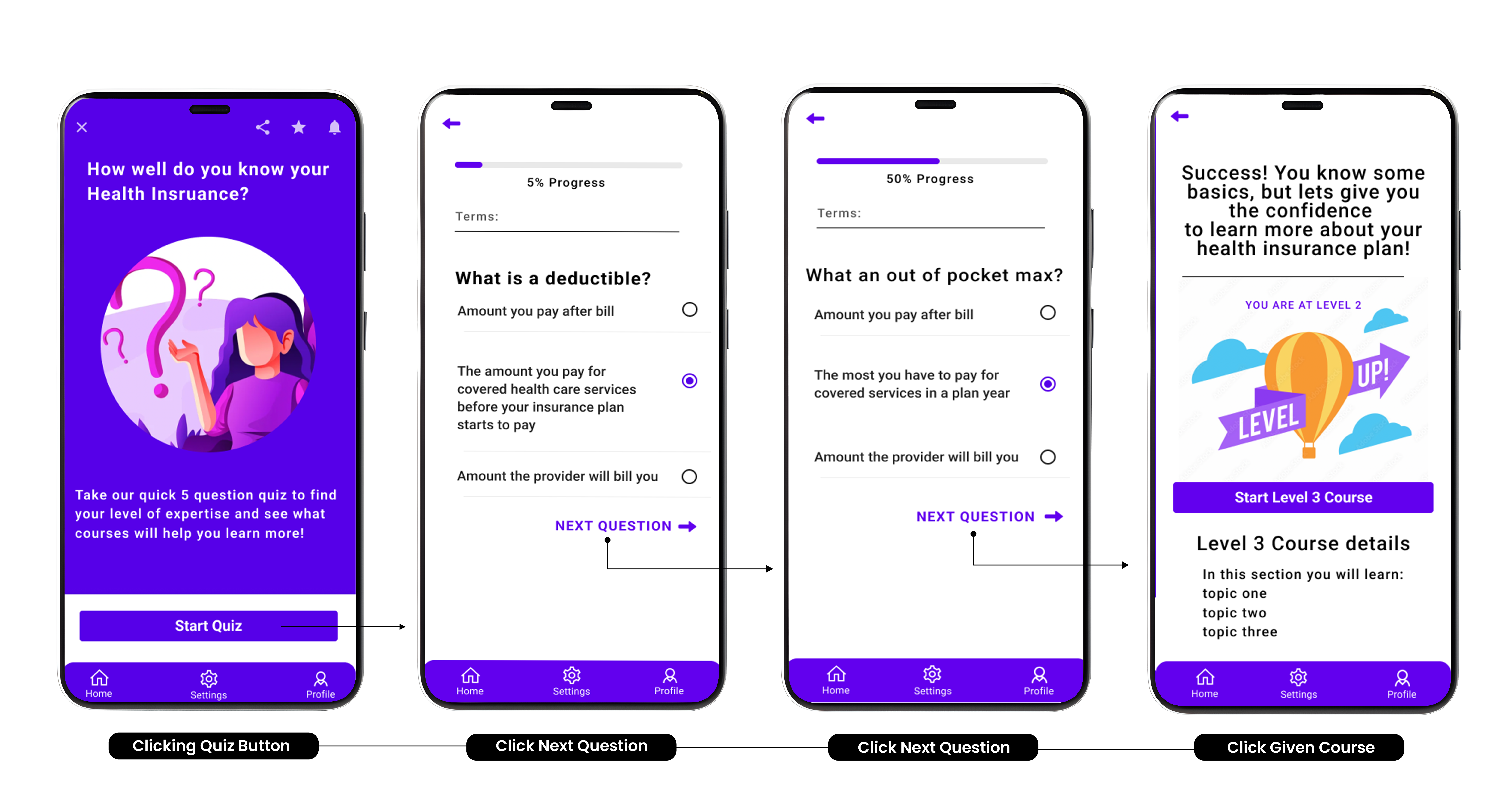
1. Initial Screen testing
Upon log in, the user will be prompted with a series of questions that will test their current knowledge of health insurance and offer course suggestions based on their results. This will allow users to have personalized lesson plans tailored to their needs in this learning experience.
2. Course Details
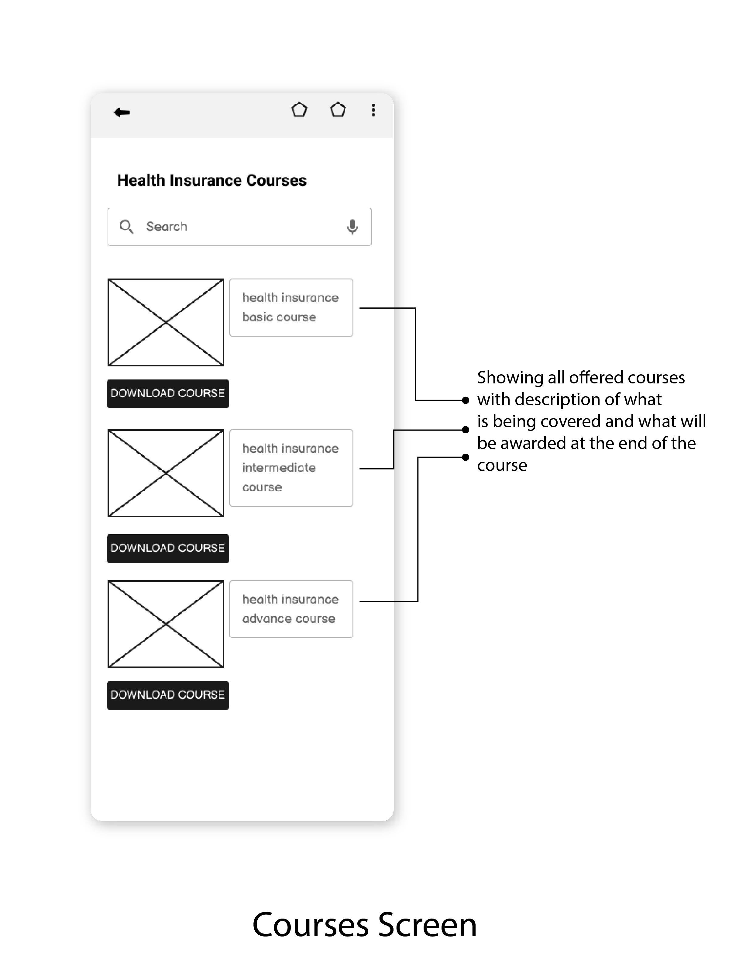
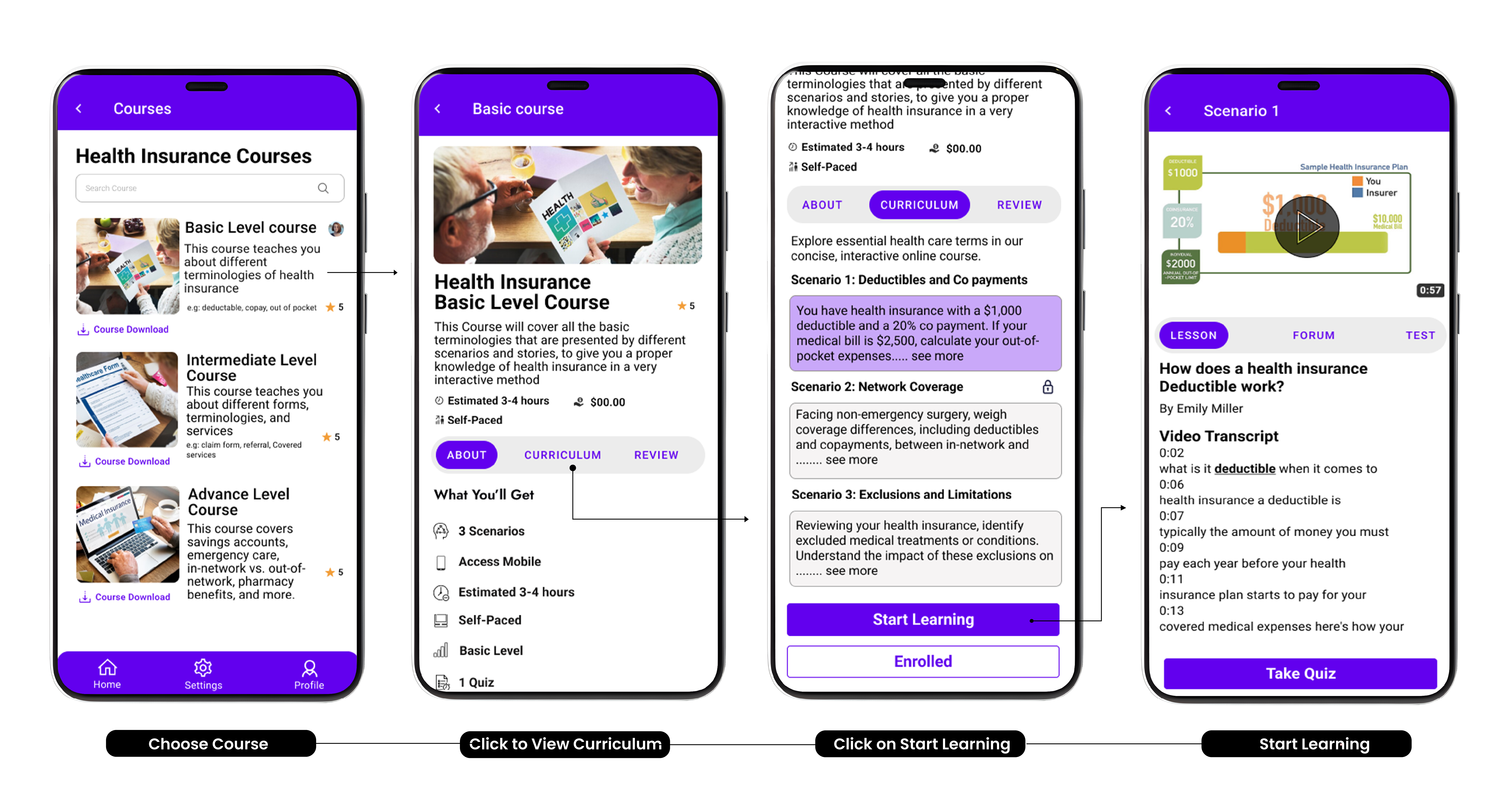
- Users will see a high-level overview of the course, including the curriculum and learning path through three tiers: Basic, Intermediate, and Advanced.
- Courses are presented in video and scenario formats, with a forum for queries. After completing the course, users take a quiz to test their learning.
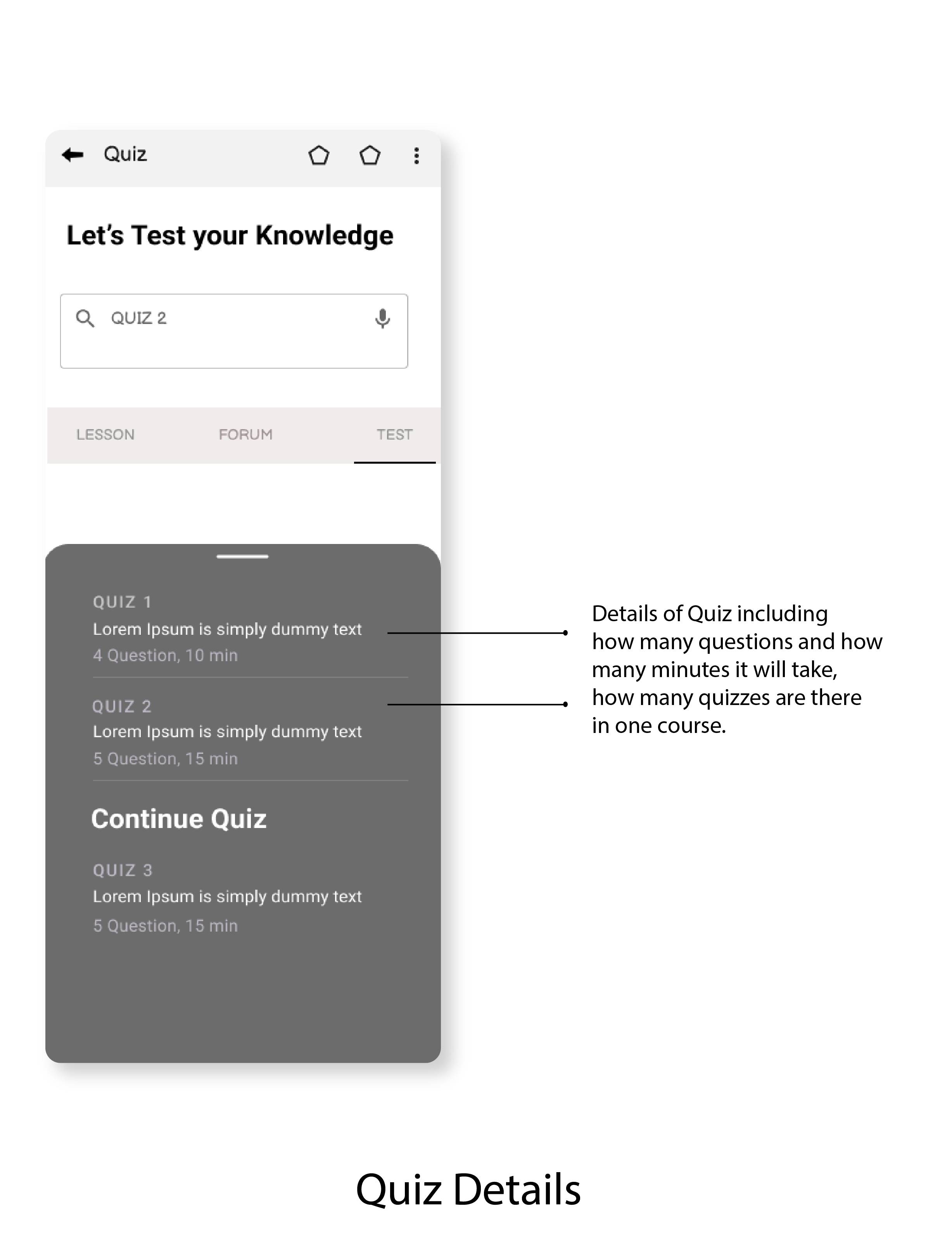
03. Quiz Details
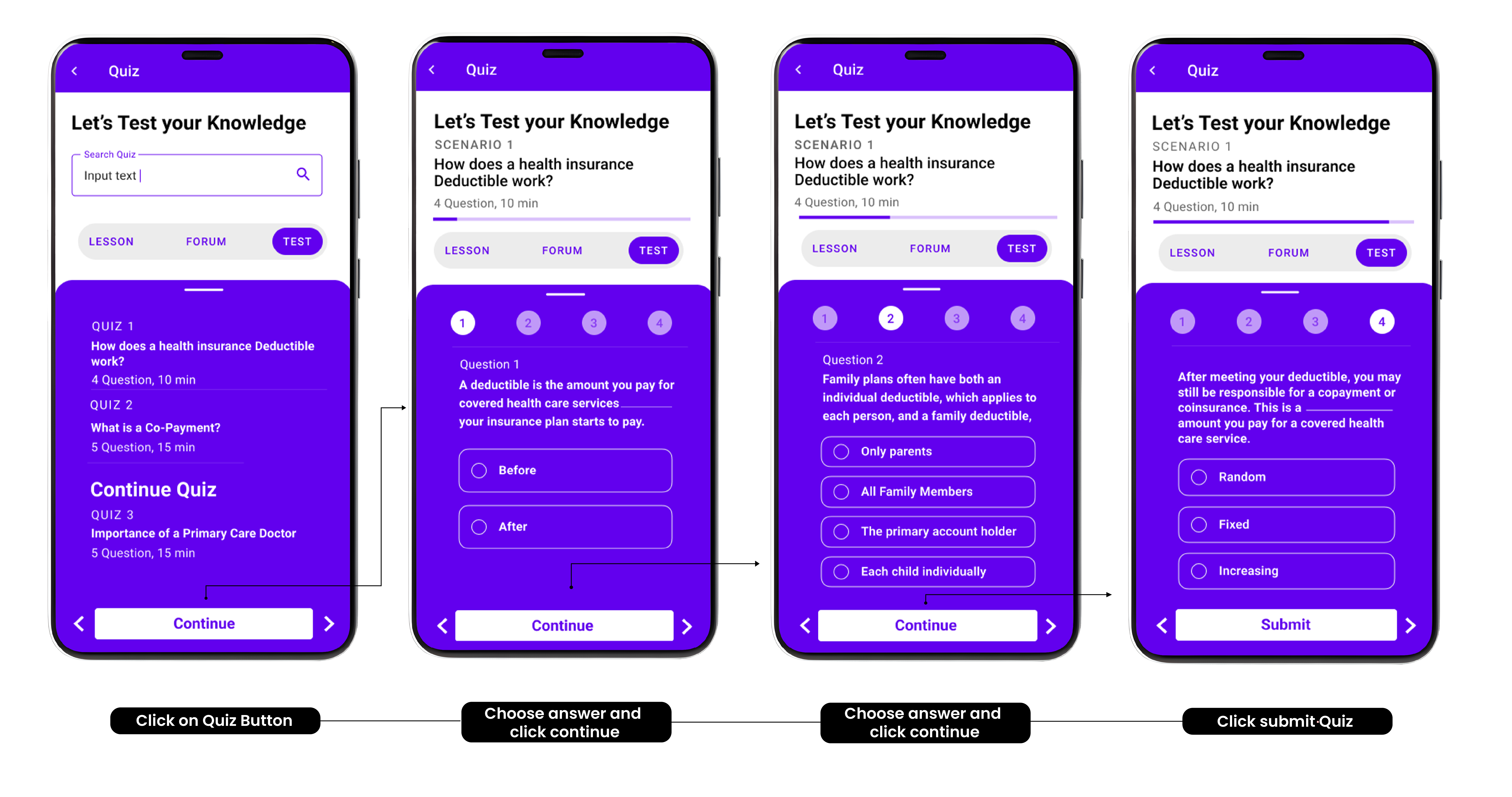
- The test will be based on the videos watched, will show user progress, indicating what to expect and how much time is remaining. The quiz will determine if the user can advance to the next series or needs to review the content again.
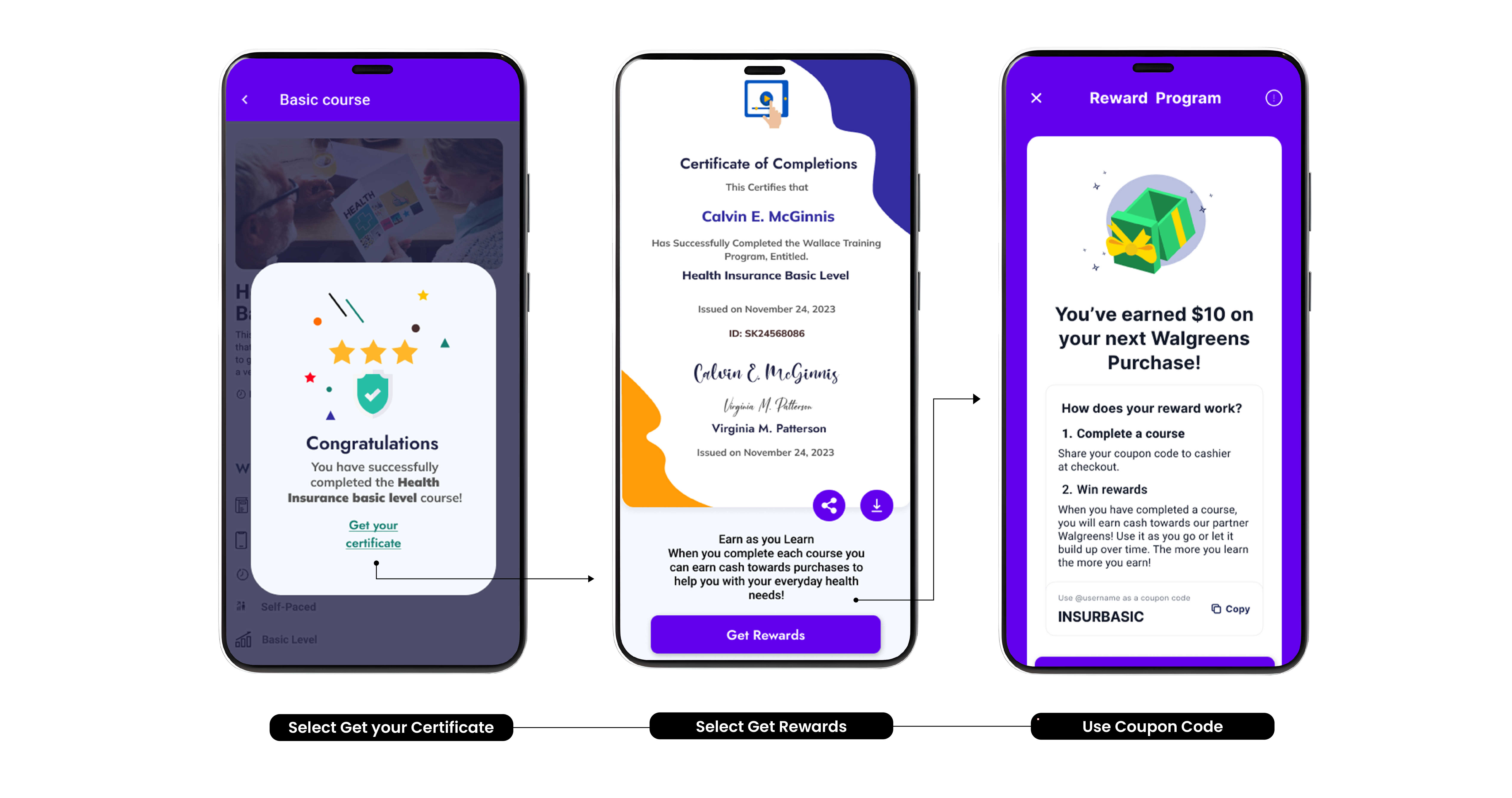
04. Course Completion Rewards
- Once the user has completed the series, they will be presented with a pop up that congratulates them on their success, they are then able to get a certificate that they can share to social media to highlight their success or an option to download to their personal device
- There will also be incentives given for those who complete the course. Health insurance is not a common thing users will want to study, offering some incentives may prompt them to be more involved with learning about their health insurance plan.
- The user will be presented with monetized rewards towards purchases with health related partners. After the users reward is claimed, they will be presented with a badge on the course they completed and know that it is time to move on to the next step to learning health insurance.
Extracting Insights
Research and Analysis
Learned about conducting primary and secondary research, being empathize towards users, got to know about how to stand out your product as from competitors and worked on divergent to convergent ideas
Design Prototypes
Learned about designing a user friendly interface on figma with designers from different background.
Team Collaboration
Learned to patiently listen others ideas, got genuine feedback, made inclusive decisions towards solutions
